INTERACTIVE SIGNS
Project Background
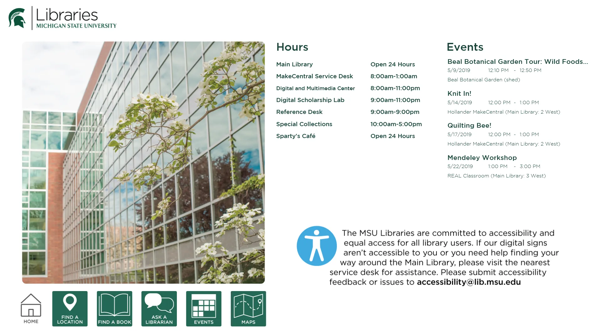
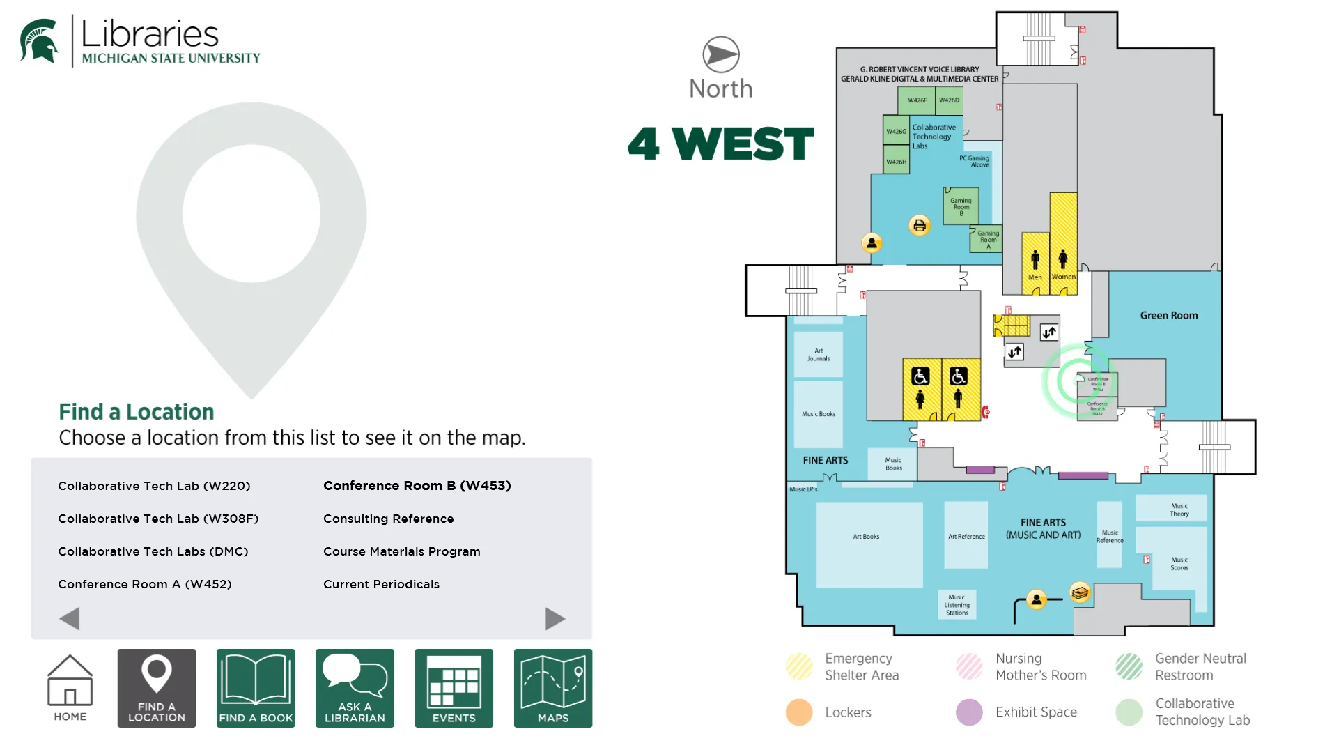
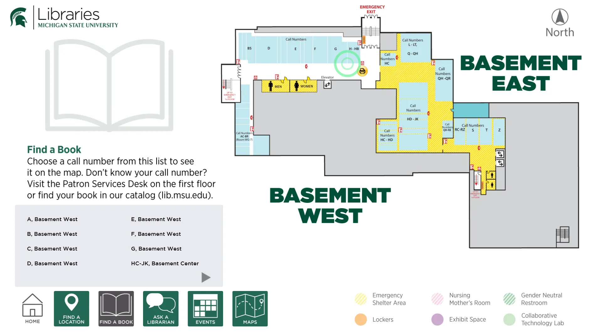
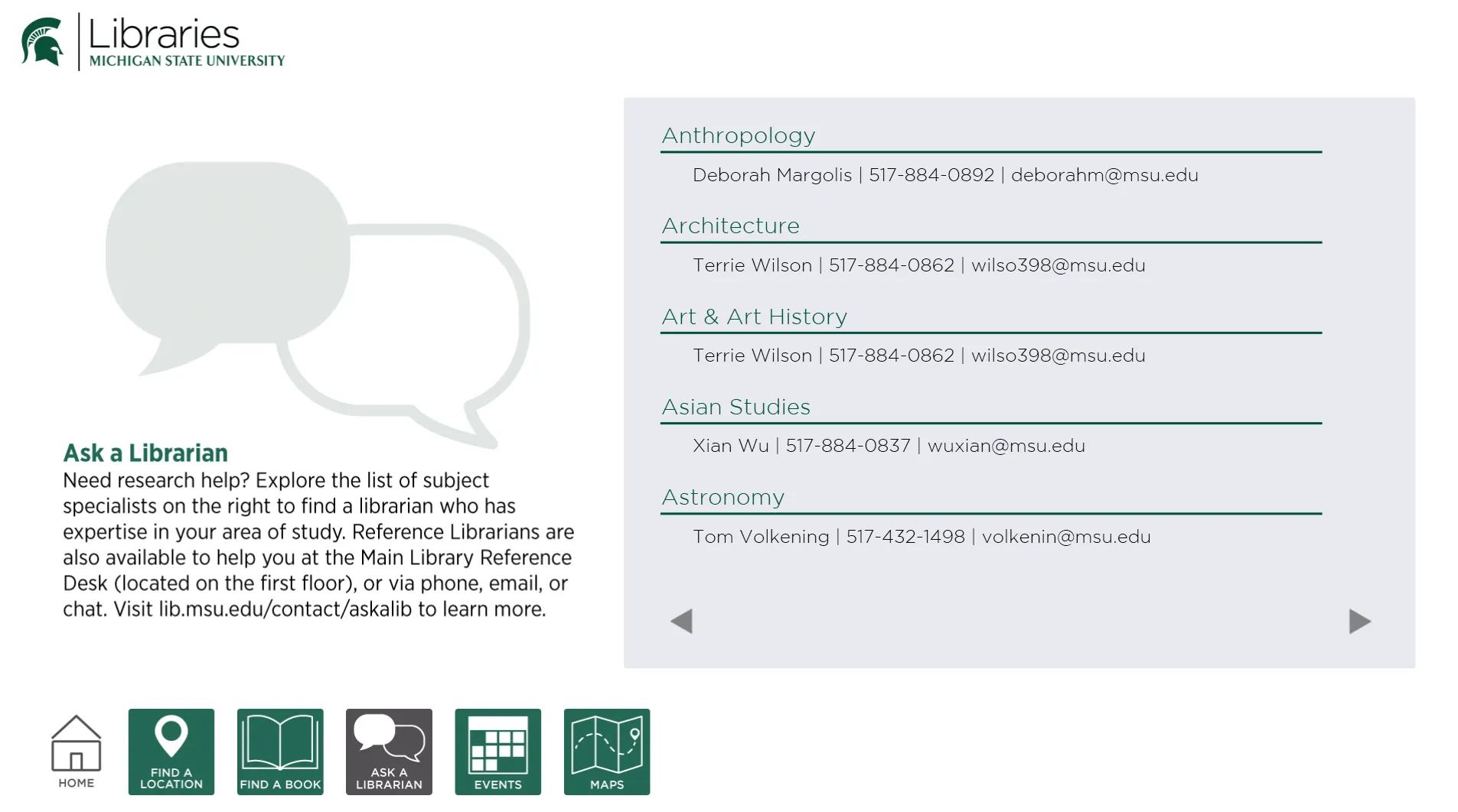
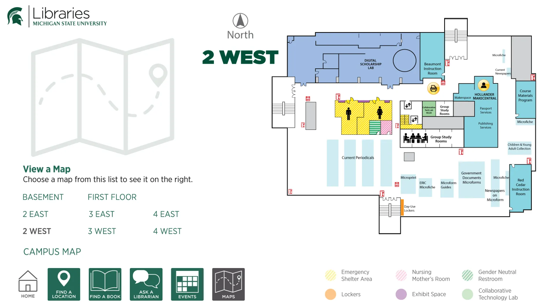
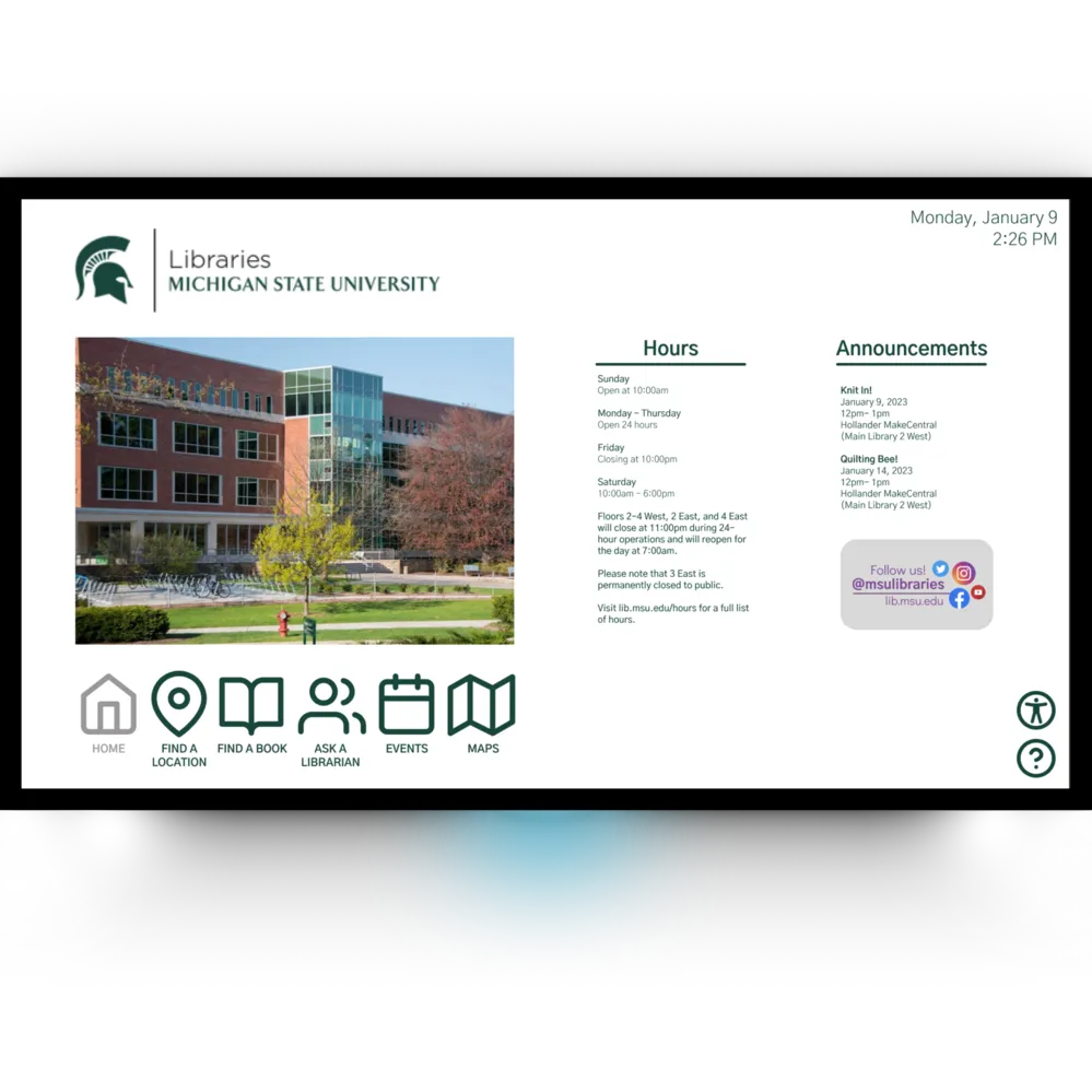
The Michigan State University Libraries originally created interactive and digital signs placed around their library in order to provide MSU students, staff, and community members a quick and efficient way to find books and information about the MSU library while they visit. The digital signs allowed for a sustainable and efficent way to provide this information. These signs are placed on large touchscreens throughout the library.
After meeting with a representative from the MSU Libraries, we learned that they were looking for an improved design of the signs, focusing on these 5 values:
- Accessibility
- Usability
- Sustainablity (in terms of materials and labor)
- Intuitive design
- Eye-catching but not distracting design
Taking these values into account, we decided to first do a research analysis study on the current use of the signs. This included conducting a field study and user interviews at the MSU Library, creating user personas, and doing a heuristic analysis on the current design before starting to wireframe and create prototypes.
Understanding User Needs
First, my team and I conducted a field study at the MSU Main Library in order gain further understanding of how users are interacting with the digital signs, understand their thoughts and feelings while interacting with the signs, and find any pain points or problems that they are running into in terms of accessibility and usability.
In order to do this, we created four tasks for a user of each profile to complete, asking them to explain what they were doing while they were doing it. Each task makes the user interact with a different page. Our questions included:
- “Show and tell me how you would find the location of the book with the call number NC18”
This task tests the “Find a Book” page, as well as a user's familiarity with call numbers and maps. - “Show and tell me how you would find where the Makerspace is located.”
This task tests the “Find a Location” page and its scrolling option for libraries. - “What hours is the Makerspace open?”
This task tells where a user instinctually looks for library hours once they’ve already located that library. - “Show and tell me how you would find the email address of the Criminal Justice librarian.”
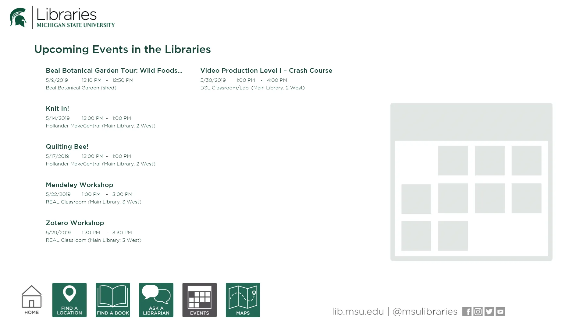
This task tests the “Ask a Librarian” page and how a user might locate and interact with the given information. - “Show and tell me how you would find “Funky Junk Journals” event.”
This task tests the “Events” page and how a user might interact with the given information.
To find library patrons to perform these tasks, we went to the MSU Main Library and asked three random people there if they were willing to participate in our research study. We specifically looked for one Michigan State University student, one library employee, and one non-student visitor in order to get opinions from a wide range of people. We did not want to solely ask MSU students in order to prevent bias in our research study.
After conducting the study, we found the following common pain points:
- Trouble clicking options. It was not accessible to people in wheelchairs, or those with low dexterity/hand strength
- The maps did not change obviously enough to the user
- Lack additional information provided, especially for library events
- Everyone wanted a search bar to improve ease of finding things
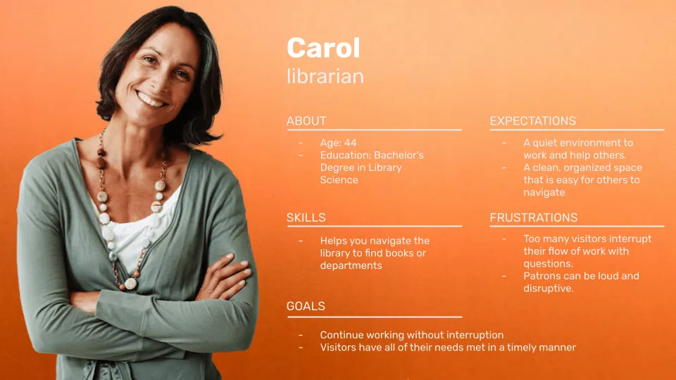
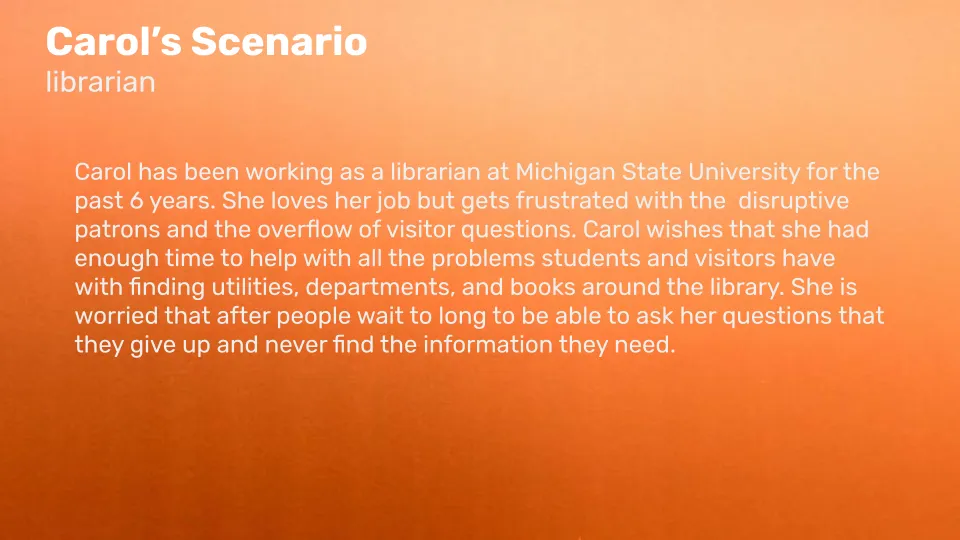
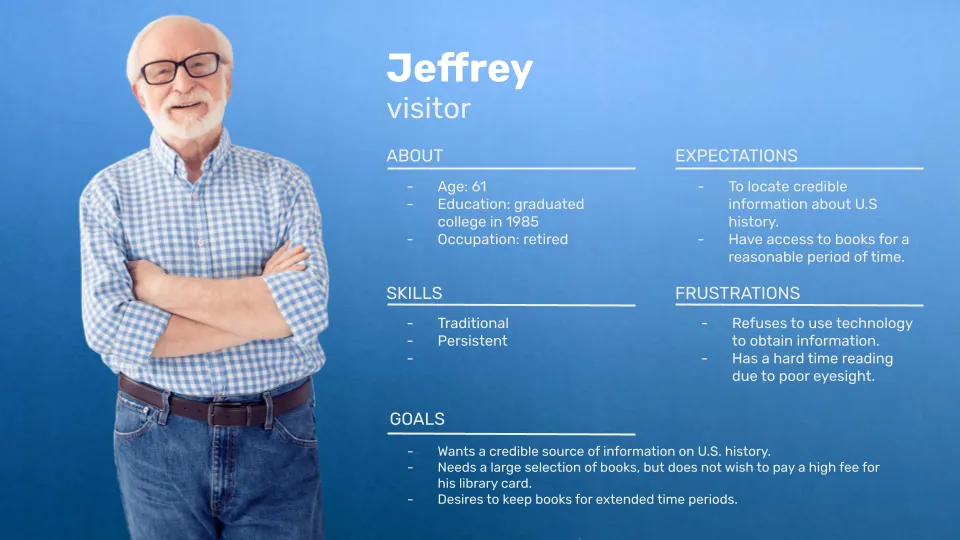
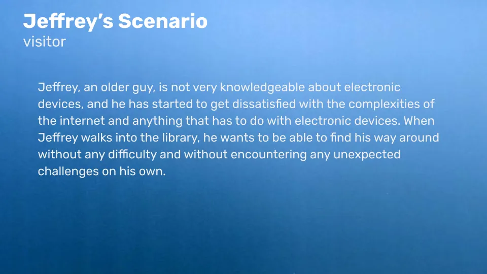
Crafting User Personas
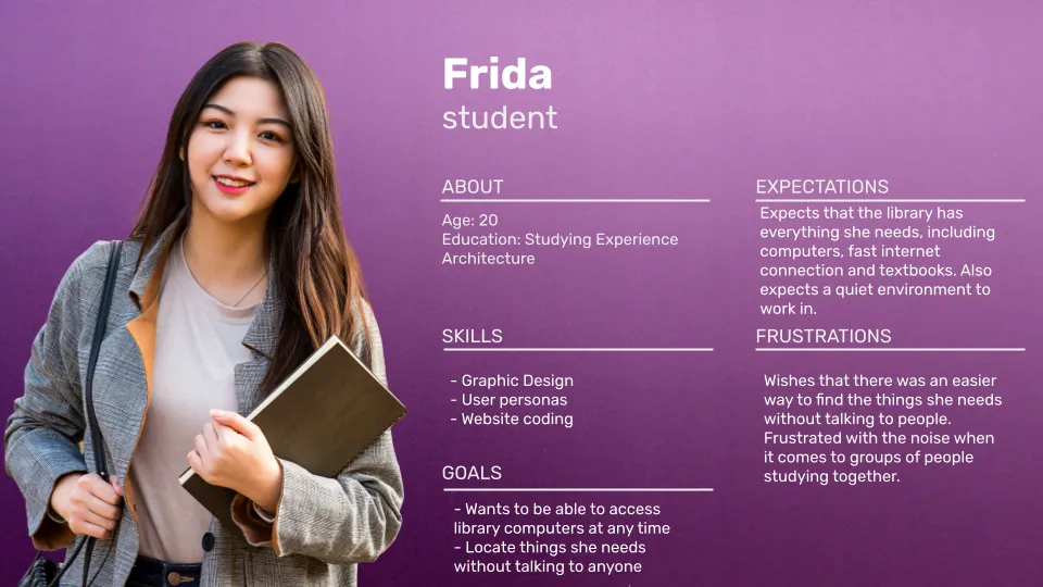
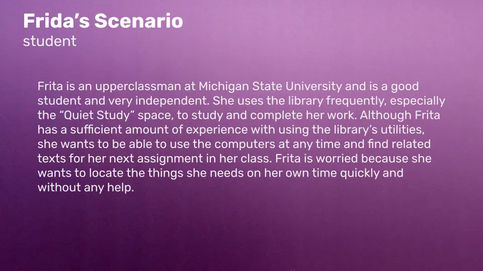
Based on the findings from the field study, we created detailed user personas to represent the library's target audience. These personas helped me empathize with users and understand their goals, motivations, and pain points. Designing with these personas in mind ensured that the new digital navigation signs would cater to their needs.
Evaluating The Existing Design
As a last step before starting the redesign process, we conducted a heuristic evaluation and analysis on the current signs. This helped us uncover specific design issues with the existing navigation signs. Key findings included:
- Non-interactive Elements: The lower green icons, listed events, and library hours displayed on the home page were not interactive, limiting user functionality.
- Inconsistent Design Elements: The home page suffered from inconsistent font sizes and spacing. Customization options and accessibility features were also lacking.
- Inconsistent layout and design: The "Find a Book" and maps pages had inconsistent layouts, colors, links, and margins, leading to a cramped, disjointed experience.
- Confusing call number system: The call number system and location titles on the maps page could be confusing for unfamiliar patrons.
- Vague event titles and limited information: The events page had vague event titles with no additional information, and lengthy titles were cut off without an option for expansion. Users lacked control and interaction features.
- Inconsistent layout and contrast: The events page and other sections needed consistent sizing, contrast, and layout improvements.
Visualizing the Redesign
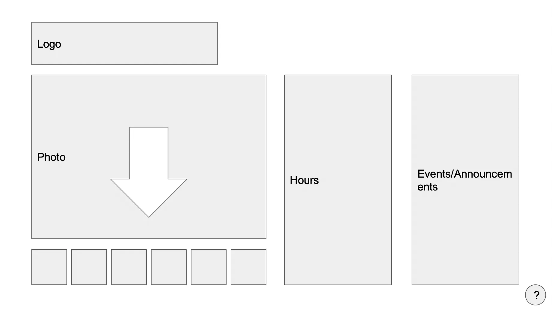
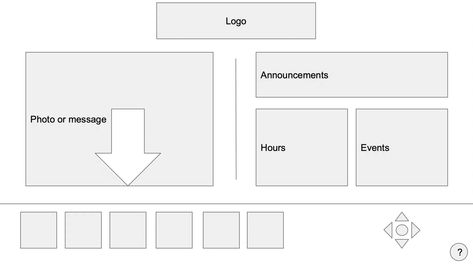
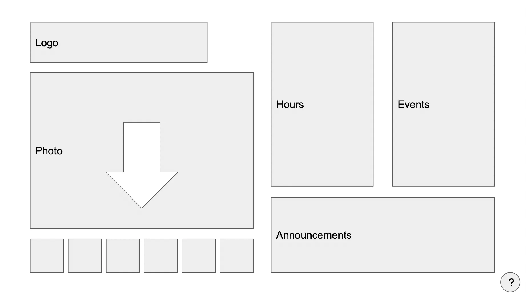
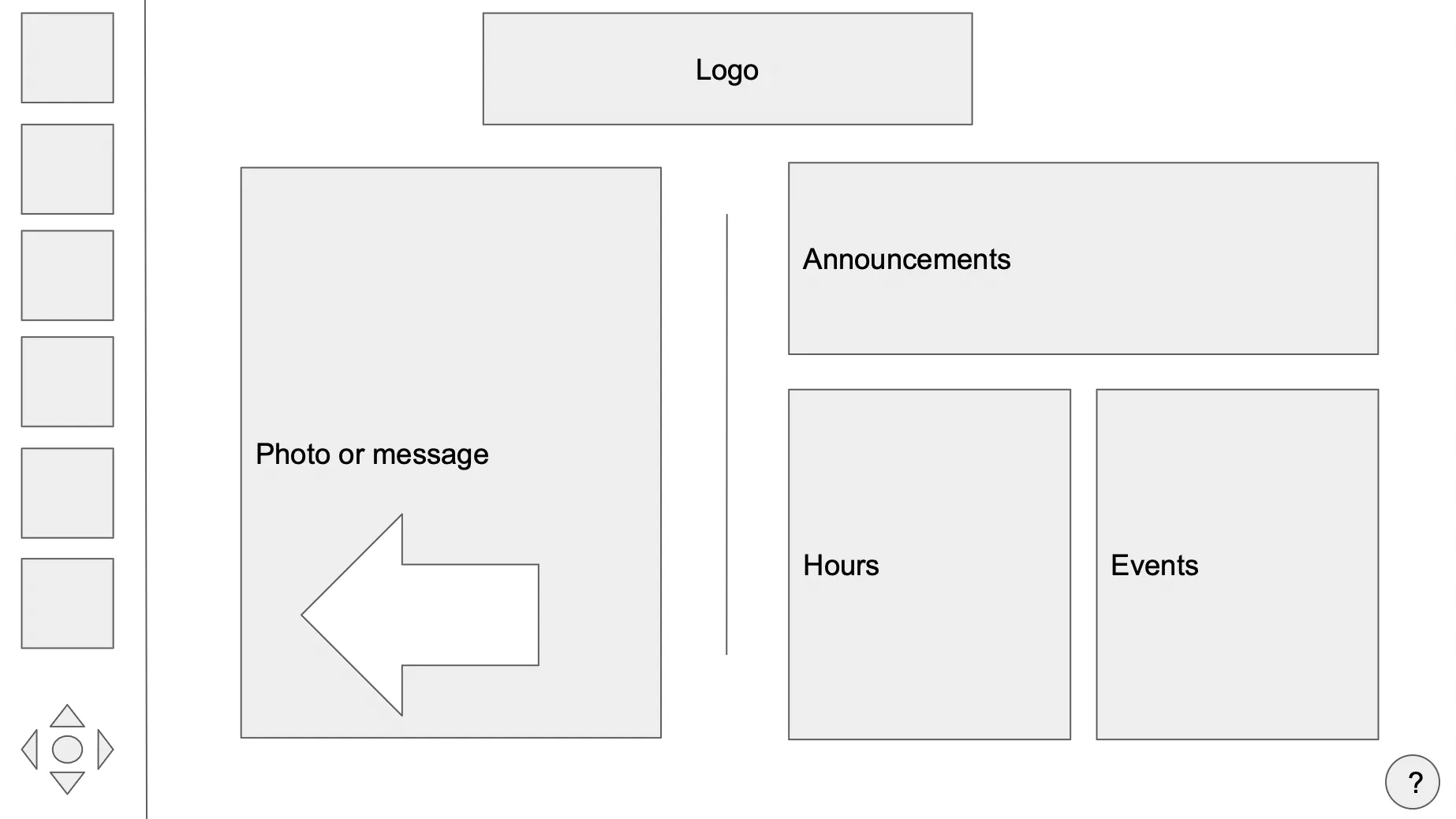
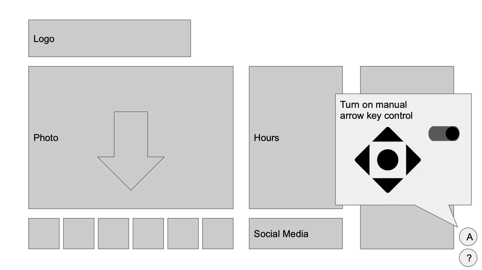
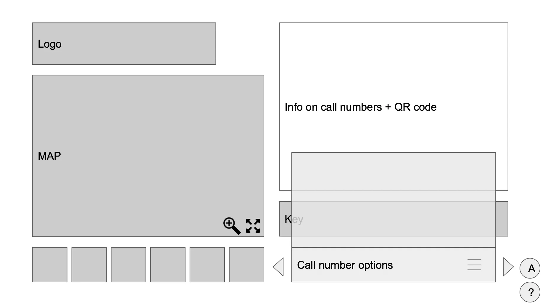
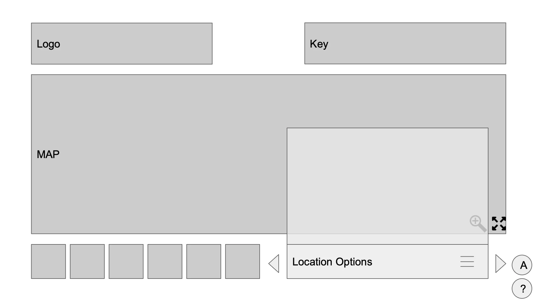
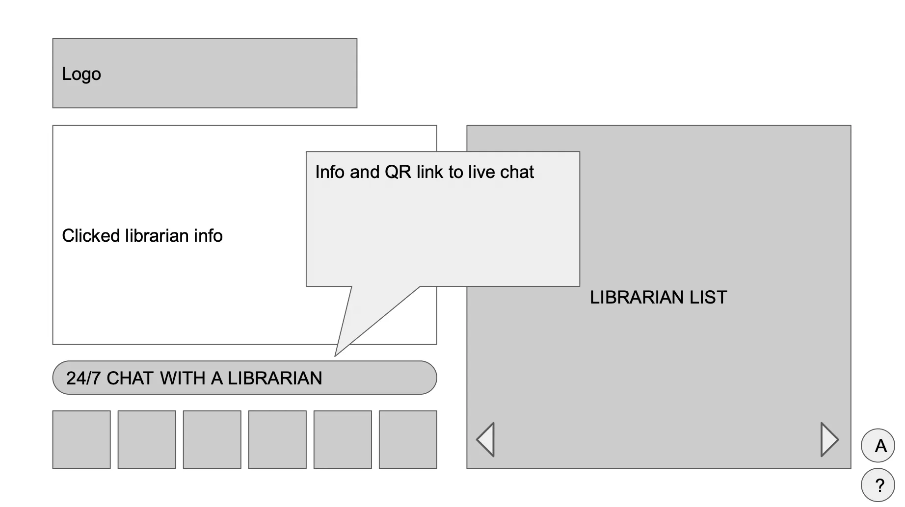
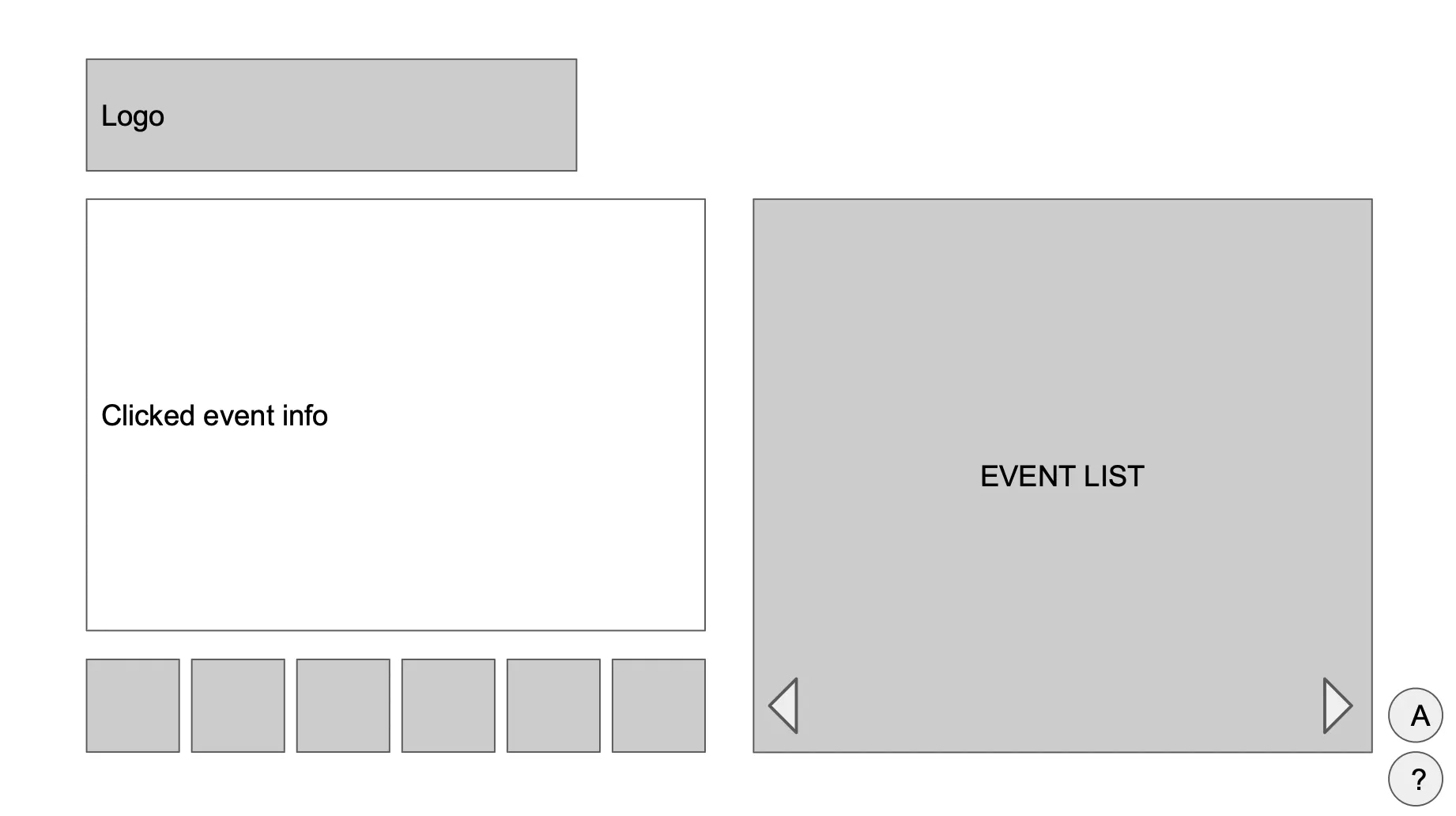
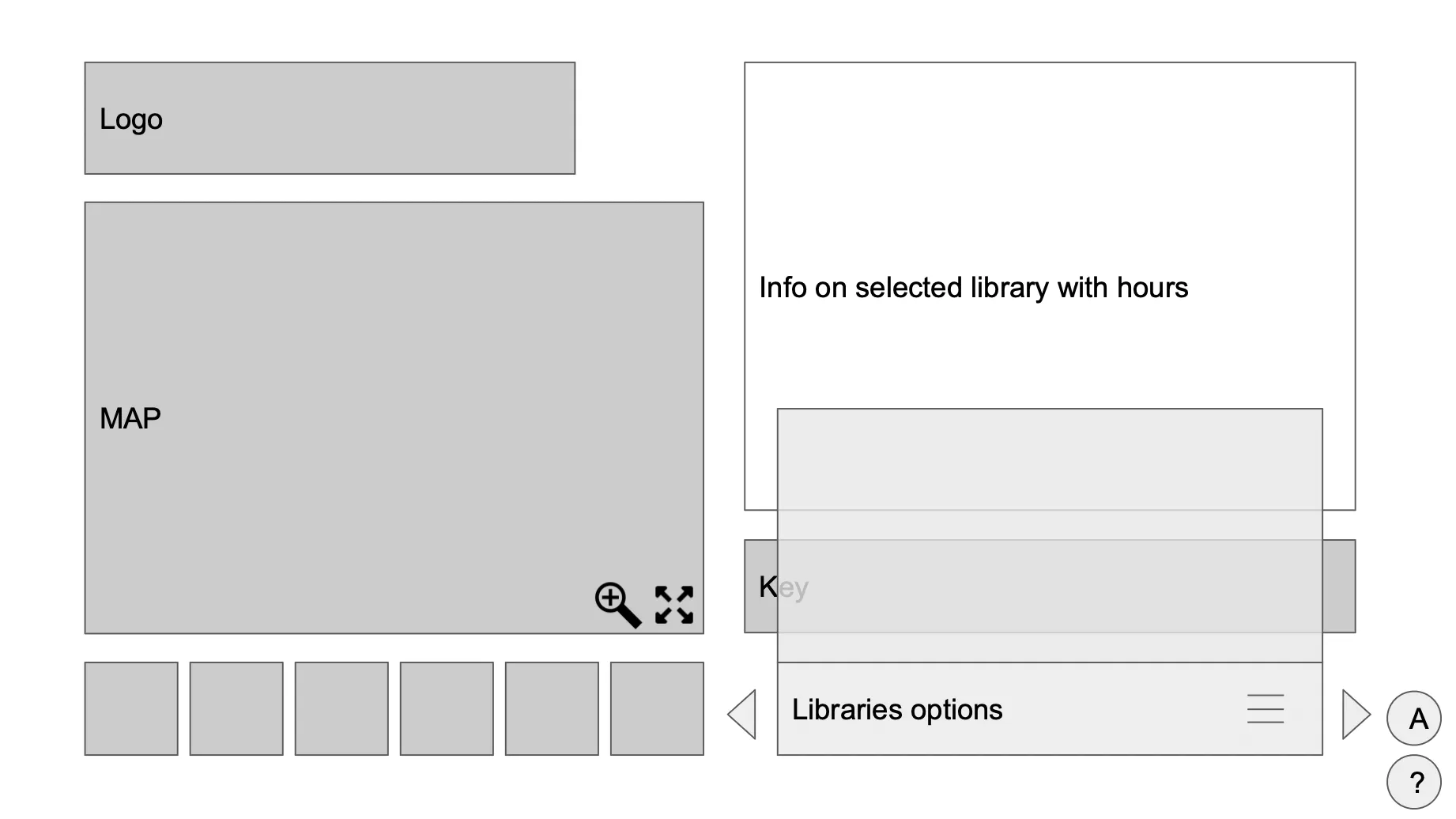
To address the found issues and create an intuitive user experience, My team and I started creating low-fidelity wireframe ideas in Google Slides in order to collaborate on ideas.
After each of my team members created their ideas for each page, we grouped together to discuss our designs, make adjustments and edits, and selected the most effective ones to create an intuitive and user-friendly interface. Information from our field study, personas, and heuristic analysis allowed our group to make informed design decisions on which ones to choose. These wireframes focused on improving information hierarchy, navigation flow, and visual clarity.
After the wireframes were chosen, we recreated them in Figma and transformed them into medium fidelity wireframes, then leading to the development of a working, high-fidelity prototype. The redesigned digital library navigation sign prototype featured the following improvements:
- Simplified Information Architecture: I reorganized the content hierarchy, prioritizing essential information and presenting it in a clear and concise manner.
- Streamlined Navigation: By incorporating intuitive gestures, users could easily navigate through the sign's interface.
- Visual Enhancements: I introduced consistent visual cues, such as icons and color-coded categories, to aid users in quickly understanding and accessing relevant information.
Reflection
This whole project has been a very insightful and has strengthened my skills in UX/UI design, teamwork, and user research. This project enabled me to delve more into user research, which allowed me me to gain some really valuable insights into the needs and preferences of library patrons. Through research and collaboration, I was able to create a user-centered and empathetic redesign that addressed both the library's and users' needs and improved the overall usability of the signs. This experience has taught me the importance of incorporating research findings into design decisions, critical thinking, maintaining effective communication within a team, and continually learning from each project. I am excited to bring these skills and insights to future projects where I can positively impact individuals and communities!
