Optimized Car Charging
Understanding The Vision
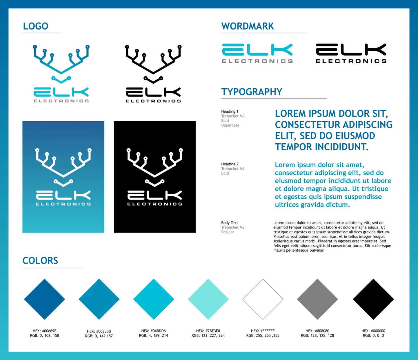
To be in line with Elk Electronics' company vision, I closely collaborated with my team. Together, we discussed their goals for the app and how users would interact with it. Simultaneously, I conducted research on competitor EV charger apps to gather inspiration and ensure our design adhered to industry standards. Based on these discussions and research, I developed a comprehensive style guide. This guide captured Elk Electronics' brand identity, including colors, typography, logos, and graphic elements. The style guide provided a starting point for the mobile app design. It ensured consistency and helped convey the brand identity to users.
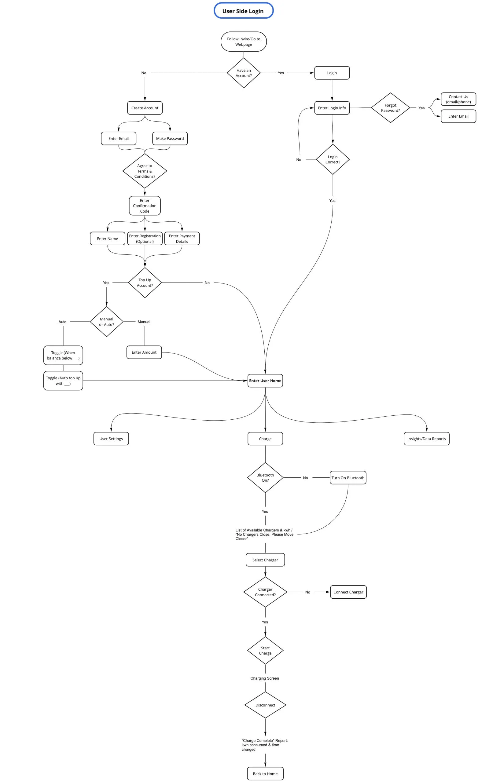
With a clear understanding of Elk Electronics' business goals, design vision, and target audience, I proceeded to develop the user flow for the app in Miro. This user flow gave us an outline of the main interactions and allowed me to identify the key pages that needed to be designed.
Unfortunately, I do not have a photo of the mobile user flow, however, below is a user flow I created for the user side of the desktop website, which has a highly similar structure.
Mobile App Wireframing
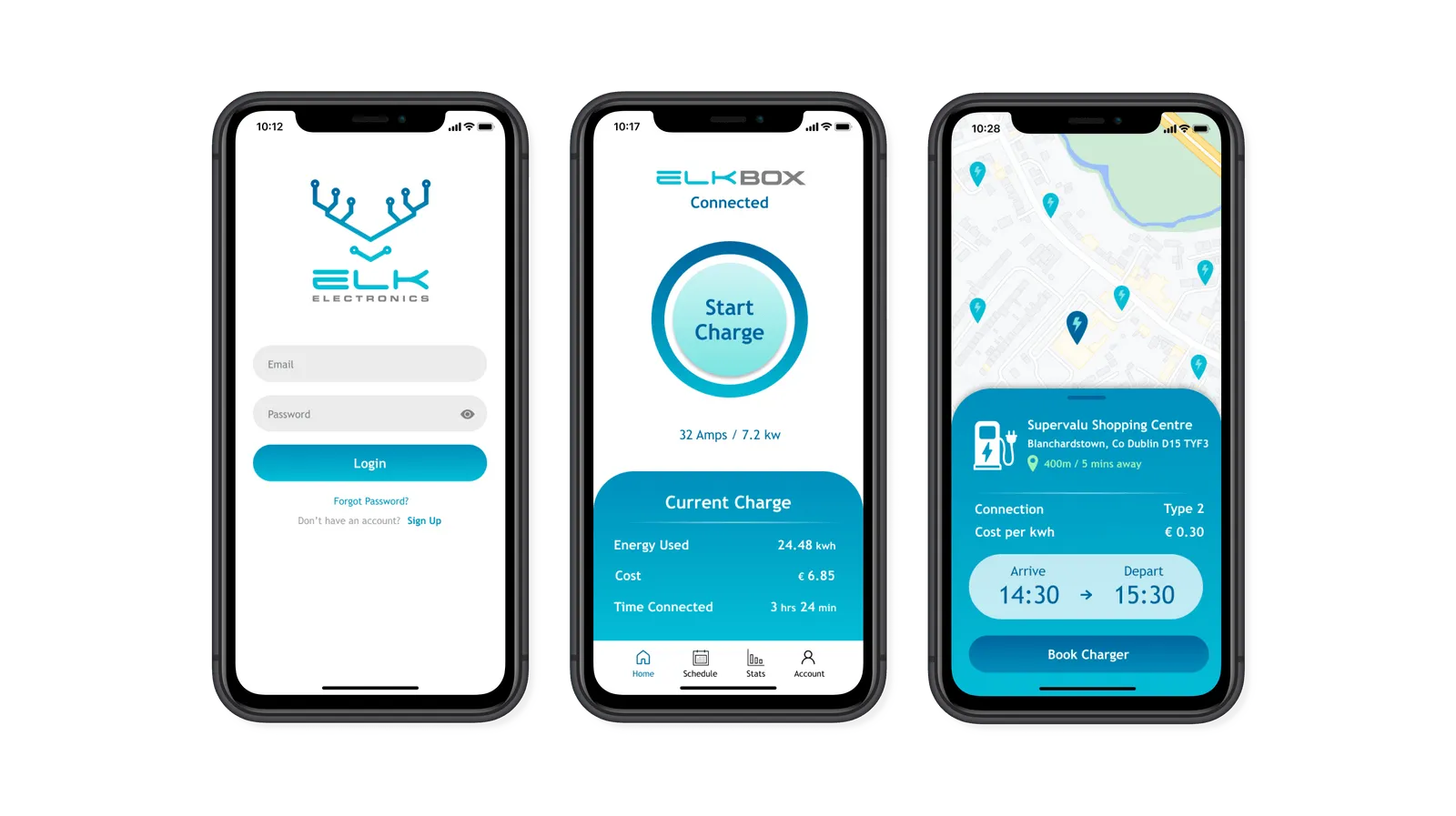
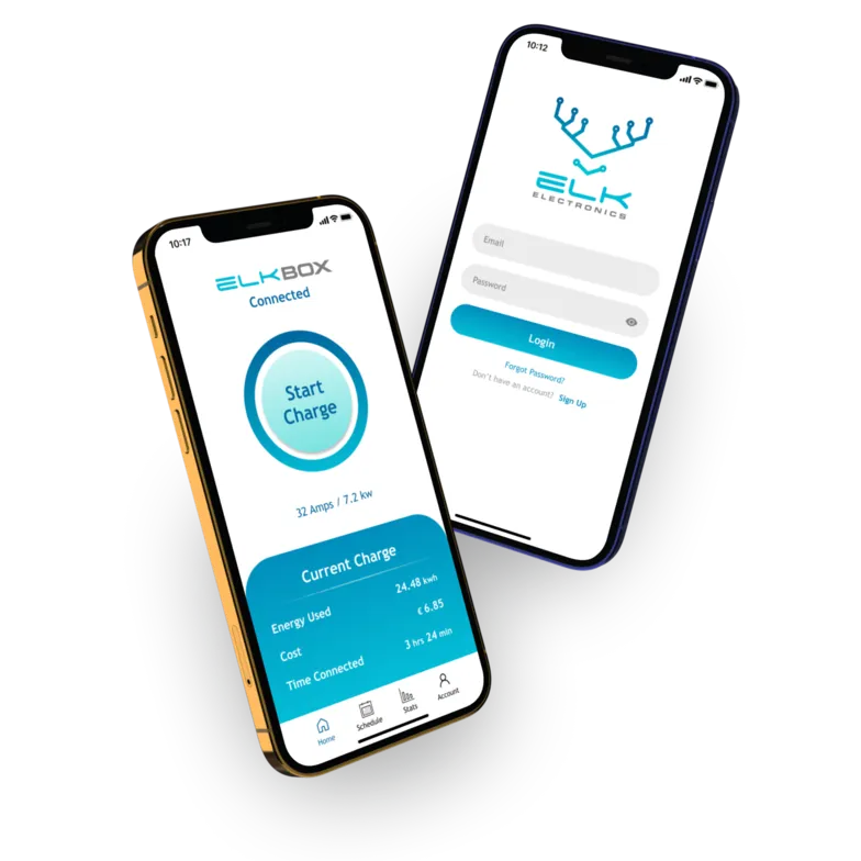
Using the user flow as a foundation, I presented some low-fidelity sketches and medium-fidelity wireframes to my team. During this process, I incorporated the feedback from my team, which led to a few different iterations of the design, including the decision to simplify the start/stop charging feature. We decided not to display the battery percentage while charging, as this data was not readily available during charging due to the charger's hardware. Instead, we opted for a more straightforward "Start Charge" button that transformed into "Stop Charge" when in use. This change ensured a clear and accessible user flow for initiating and monitoring charging sessions, that was in line with hardware limitations.
Unfortunately, I also do not have any screenshots or photos of this process because the Figma file was edited to create the final high fidelity wireframe and prototype.
Crafting High-Fidelity Prototypes
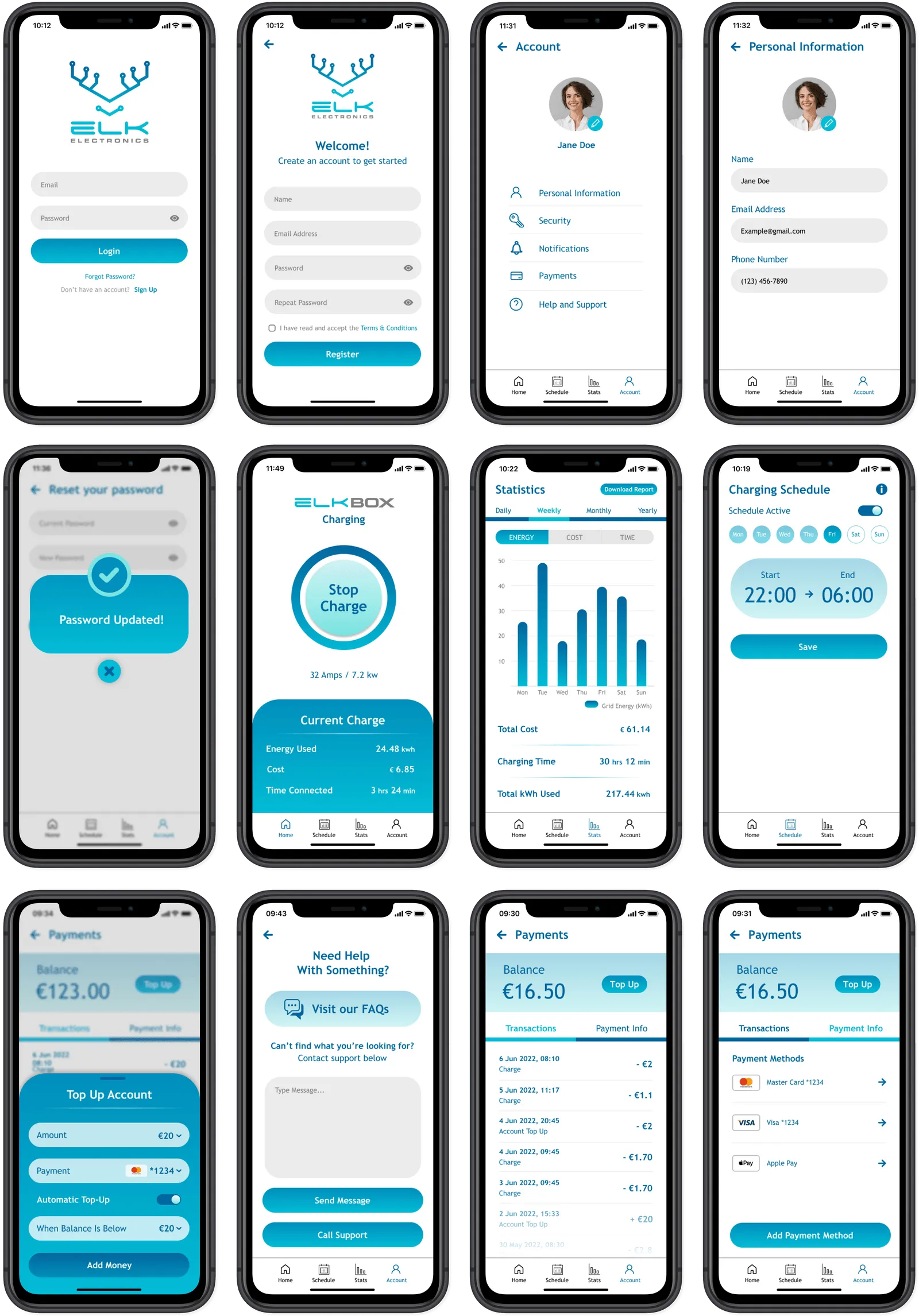
Taking use of the style guide and staying in continuous communication with my team with multiple design iterations, I translated the wireframes into a high-fidelity prototype. The app design not only adhered to accessibility guidelines but also had a sleek, modern aesthetic that the company was looking for. By incorporating the gradient from the brand's logo and employing a light background to enhance contrast, I created a visually engaging and user-friendly interface for Elk Electronics' car charging app.
Designing Pop-Ups
After the full prototype was created, my team called for adding in a few different essential in-app notifications and pop ups. In response this, I designed some visually engaging pop-ups using flat icons and colors that were consistent with the style guide. To ensure usability, each pop-up included a clear exit button, making it easy for users to dismiss the messages.
Reflection
Throughout this internship, I learned the importance of collaboration to create designs that align with both product vision and hardware limitations. By incorporating the style guide into the app design, we maintained a cohesive and distinctive brand identity. While time constraints limited extensive user research, we optimized available resources to deliver a design that is accessible, intuitive, and visually striking.
Overall, this was a great experience that allowed me to showcase my ability in creating user-centered and impactful designs. This internship strengthened my design skills and passion for delivering solutions that resonate with users and leave a lasting impact. I am so grateful for this opportunity and really look forward to applying the knowledge and skills i gained here in future design projects.
