Comic Con Bingo
A multiplayer scavenger hunt app that transforms convention downtime into an engaging exploration experience
Role:
UX/UI Designer
Timeline:
Half a semester (class project)
Skills:
- User Flows
- UI Design
- Interaction Design
- Visual Design
- Branding
Tools:
- Figma
- Photoshop
Problem and Context
Designing for convention downtime
Convention attendees face significant downtime between panels, signings, and events. While they're eager to stay engaged with convention culture, there are limited structured activities that encourage exploration of the venue and interaction with the community. Existing solutions require attendees to passively wait or wander without clear direction or reward.
I set out to design an experience that would give attendees a fun, low-pressure way to discover convention elements they might otherwise overlook while offering tangible incentives through real-life prizes at a Comic Con Bingo booth.
Understanding attendee needs
Since this was a conceptual class project without access to actual convention attendees, I developed a user need statement based on secondary research and my own observations at fan conventions. The core insight was that attendees want activities that align with their fandoms, provide clear goals, and don't require extensive commitment or coordination with others.
From this, I identified three key user needs:
- Accessible engagement that works during unpredictable gaps in schedules
- Social motivation through light competition without barriers to entry
- Recognition and reward tied to convention culture
Defining the Experience
Mapping the game flow
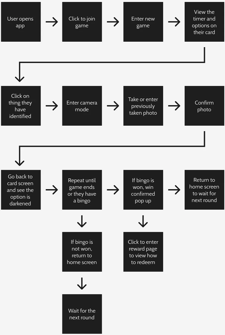
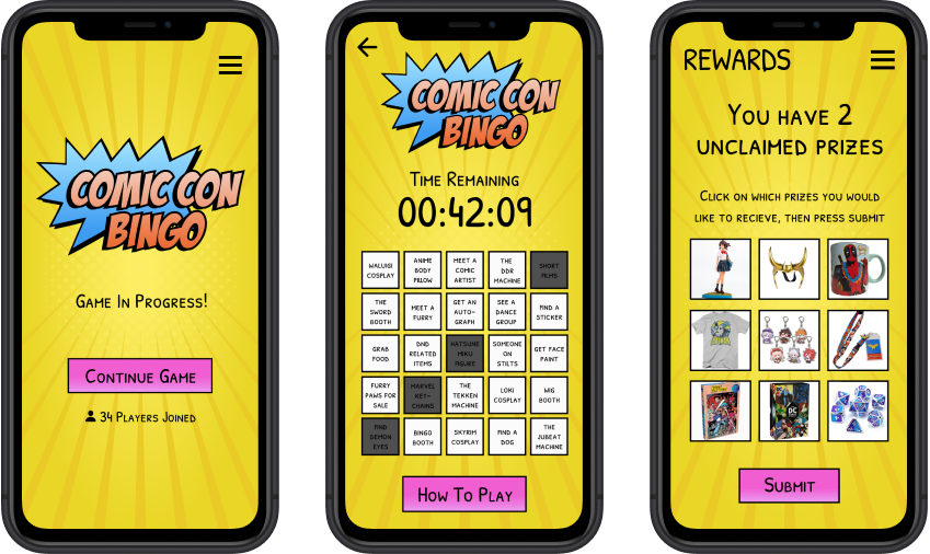
I mapped out the full user flow to ensure the game mechanic would be intuitive and frictionless. Players would join an active game from the home screen and receive a randomly generated bingo card featuring convention-specific items (cosplayers, booths, signage, etc.). The challenge: photograph these items within a set time limit, turning the card into a timed scavenger hunt.
When players tap a bingo square, a camera prompt appears, allowing them to either take a new photo or upload one from their library. This flexibility was important, as convention WiFi can be unreliable and attendees may capture images before formally joining a game. The first player to achieve five in a row wins prizes at a designated booth. Non-winners return to the home screen to join the next round, maintaining continuous engagement throughout the event.
This structure balanced ease of use with competitive excitement and encouraged venue exploration without overwhelming users with complex rules or lengthy onboarding.
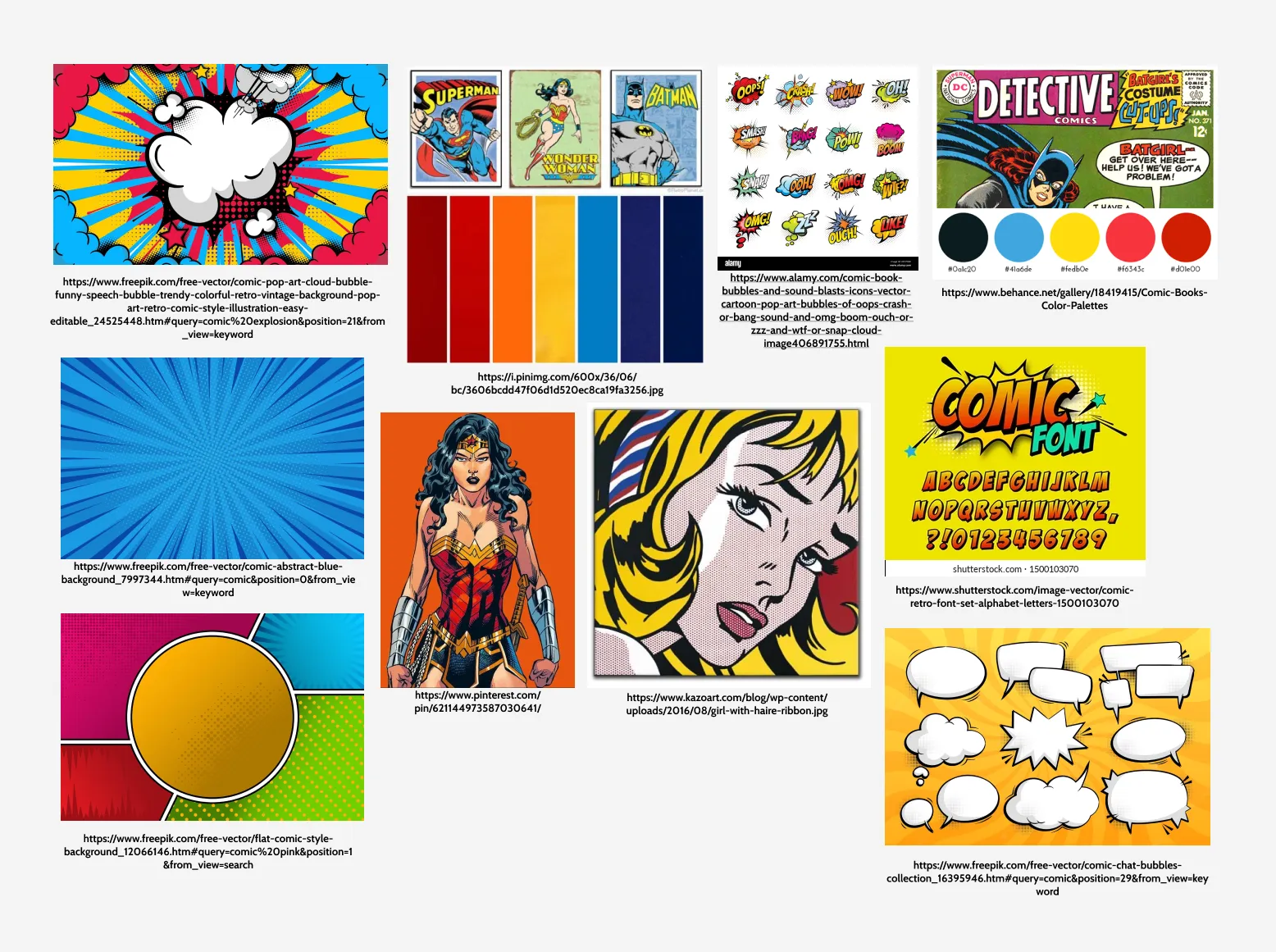
Visual design and mood
To establish the app's visual direction, I created a mood board that drew from comic book aesthetics: bold primary colors, halftone textures, comic-style illustrations, and pop culture references. The goal was to make the interface feel energetic and on-brand with convention culture while remaining legible and functional.
I chose vibrant colors commonly found in traditional comics and designed a logo in Adobe Photoshop that reinforced the playful, nostalgic tone. This visual language carried through to all subsequent design phases, ensuring the app felt cohesive and culturally relevant.
Wireframing & Iteration
Initial sketches and explorations
I started with low-fidelity paper sketches to explore layout options and interaction patterns. At this stage, my priority was simplicity. I wanted to ensure that players of all tech literacy levels could understand the game mechanics at a glance.
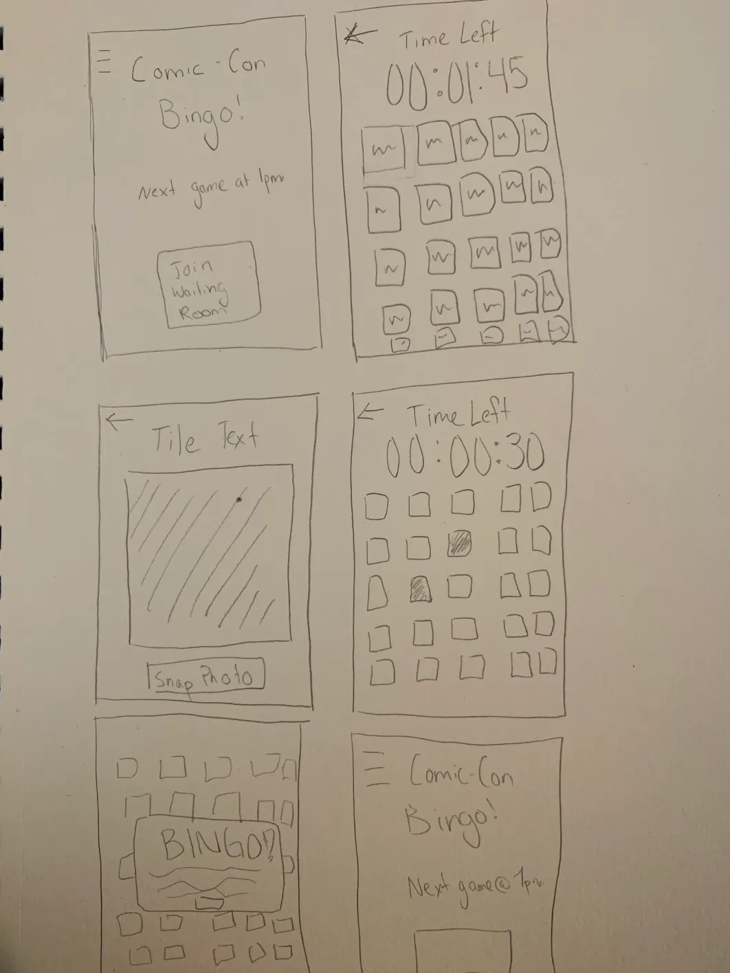
From sketches to refined wireframes
From there, I moved into medium-fidelity wireframes in Figma, refining the visual hierarchy and incorporating gestural interactions (tap to open camera, swipe to browse cards, etc.). I shared these with classmates and received feedback that informed adjustments to button sizing, prompt clarity, and flow transitions. For example, early iterations buried the camera prompt too deep; I revised the design to surface it immediately upon tapping a square.

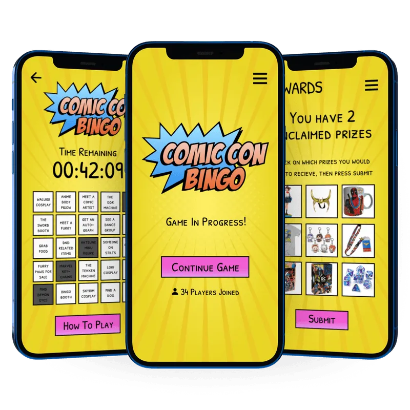
High-fidelity design and prototype
The high-fidelity wireframes brought the mood board to life. I applied the comic-inspired color palette, incorporated the custom logo, and added subtle animations (button presses, card transitions) to enhance the sense of excitement and immersion.
Attention to micro-interactions was critical. For instance, when a player completes a row, a brief celebratory animation reinforces their win. When a round ends without a win, a friendly prompt invites them to try again. These details helped sustain engagement and emotional investment.
Final interactive prototype
The final prototype brings together all design decisions, showcasing the full user experience from game entry to completion. The embedded Figma prototype below demonstrates a complete game loop: joining a game, photographing bingo items, submitting photos, winning or returning to the home screen, and repeating.
Reflection
Acknowledging project limitations
As a class project, this concept wasn't validated with real users or tested in a live convention environment. I made design assumptions based on general UX principles and secondary research, but lacked direct feedback from the target audience. Additionally, I did not address backend considerations such as photo verification, prize distribution logistics, or scalability across different convention sizes.
Key learnings and next steps
This project taught me the importance of anchoring design decisions in user context, even when working conceptually. By grounding every choice in the user need statement and imagined scenarios, I was able to create a cohesive experience that felt purposeful rather than arbitrary.
I also learned that clarity beats novelty. Early on, I experimented with more complex game mechanics (team modes, bonus challenges), but feedback and iteration revealed that simplicity would better serve users in a chaotic, distraction-filled environment like a convention floor.
If I were to revisit this, I would prioritize testing with real attendees to uncover friction points I couldn't anticipate and explore how the app might integrate with existing convention infrastructure (badge scanning, official apps, sponsor partnerships). The visual design holds up well, but the true test would be whether it drives the exploration and engagement I designed it for.